So, after much thought (an afternoon and many evenings and probably years) we devised a set of rules by which to animate by. These are based on the writings of those more learned than us, but also on some basic principles by which I know all creativity and storytelling works by.
Firstly, boundaries. Without boundaries and a blank sheet, you're fucked. So make up some rules, interesting and general ones, and creativity will begin to solve problems and develop ideas inside those boundaries.
Rules are boundaries I guess.
First of all, to our animator. To all creative staff. This must be something new, unique and undone before in your work history to date. Otherwise there'll be no transformation and the idea will be stale, a cliche or derivative and probably someone else's work. Of course, there is nothing new, but we must believe it to be new and hope to get as close to original as possible. It must, however, transform us. Sounds godly, isn't meant to be. But how else to make a mark but break out of all previous moulds.
Rule 2
Constant Movement. I don't know where I got this from. Honestly. But I want constant movement. Characters must always be moving. People are always moving when they speak, and especially when they listen - since most people don't really listen and are actually thinking about something else, or what they are going to say next.
Rule 3
Building on from that - if there is to be constant movement with the character (not fake pans and tilts, which is a cheat way to create constant movement) then the characters must be in constant movement - and their movements must be simple, repeatable and from the INTERIOR of the character. Not the EXTERIOR. Its not to look nice. Its to communicate the core values of the character, not look 'human'. Which means we develop a set of movements for each character based on the traits of that character. And with, say, four basic movements, we vary those, both in how we mix them (1 and 4, 2 and 3, 3 and 4, 1,2 and 3, etc, all variations possible) we also then mix them in VOLUME of movement.
So, a subtle 1 and a strong 2, etc.
We'll still need eyes, etc and mouth shapes, but this combination of movements, in constant motion will keep the character interesting to the eye, as well as responding to the environment. But, all based on the INTERIOR states represented in PHYSICAL MOVEMENT.
Rule 4
Building again from Rule 2 and 3 - Rule 4 says that the movement must be funny. This is comedy. So the movement - the 'idling' position of each of the characters - must be humourous enough to make a laugh. If we can laugh at the character in silence, in 'idle', we've found them, and we've won.
Rule 5
Stealing this from South Park and David O'Reilly - we must achieve Asthetic Coherence. In other words the 'style' we develop (the combined psychology of all the core creative team projected through the idea) must be consistent within itself. And professional enough (beautiful enough) to be watchable.
That's it. There's your principals.
Sunday 22 April 2012
Friday 10 February 2012
Monday 30 January 2012
So whose buying adult animation
This could take a while...
My guts tell me the likes of Adult Swim, Sci-Fi, FX (UK and US) is a potential home. Out of all of these the one I'd lean to is Adult Swim, but its probably considered very out there and it'd be more of a sneak attack to see if we can squeeze in the backdoor of wider broadcaster. That said, AS put on great shows and seem to have a rock n roller kick your hole out attitude.
THE GLOBAL INDUSTRY, NOT JUST THE STATES
It's very easy to get sucked into selling in the States. There is a lot of great programming, and a lot of shite. But, they speak English and are a huge market with a lot of buying power. However, what about other countries in Europe. We could easily voice Dangerous Days for a French market. In fact, in some ways, it might suit a French audience more to watch it, I don't know. Certainly, if there is a market for it, it will come from consumers who I think enjoy something familar/something different and those with the toleration to watch animation. Which isn't everyone.
I don't have the stats for what country watches the most animation - I'm sure it exists - or what country, per head, spends the most on animation, but it can't just be the States.
I keep on thinking Germany and France, but again this is probably because they are large countries with a lot of State infrastructure and probably broadcasters who've bought before. Or maybe, no one has.
Is there any prestige to be hand in making happen a series first?
I guess only if it does really effing well is the answer.
Some of the questions might be below - see link - if I would want to pay 2000 grand for the privilege.
http://www.screendigest.com/reports/09theglobalanimationindustry/pdf/SD-11-03-TheGlobalAnimationIndustry/view.html
GERMANY
Find out some more about it.
FRANCE
And the lovely French animation watchers.
A QUESTION ABOUT MAKING IT
There is a bull in the corner snorting his hole of because he's not being noticed.
What the fuck do you do with a commission? You still have to make it, obviously. And that can't be done in little old Northern Ireland. The place to go would be the South, but even then it only really makes sense to contract out the main drawings to India, or somewhere like it. Estimates are it is 60-70% cheaper to go down that route.
Don't we need a Producer for all that? Or at least someone to run with, help with all of this side of it.
ANIMATION WORLD NETWORK
Tuesday 13 December 2011
Animation
Sony are adapting a graphic novel. Putting aside all the Dark Knight stuff (for a moment) and the Marvel and DC Adaptations, this feels more like an independent affair. A smaller more localised story.
http://www.cartoonbrew.com/biz/graphic-novel-chickenhare-set-for-feature-at-sony-pictures-animation.html
And, a dodgy link to some 'animation styles', i.e. cliched tropes. But...
ANIMATION STYLE
I know we are set on doing 2-D, but what are the limits of that actual technique. How far can we go? How can we do something that hasn't been done before in 2-D?
How to develop a style that maximises 2-D?
Okay, so, brilliant 2-D then.
Really good use of backgrounds in this. Ramps up the 2-D into something more. Simple use of character movement - very economical but thoughtful.
Sorry, once again, side tracked. Check out this one. It's 3-D, but its, well...
Interesting Sound Design, but that's a whole other blog.
Hmm. Note to self - come and look at this CG website: http://forums.cgsociety.org/archive/index.php/t-798571.html
SIMON'S CAT
Lovely stuff. How was it done? What was it done on? Is it cell?
Love the static backgrounds, with loads of action in the foreground. And the thought that's gone into every scene. It's also huge, so people are prepared to watch this type of stuff.
MORE EXCELLENT 2-D
Just using a white space on a black background. On vice versa. Even using stick figures, or manipulations of that.
SILHOUETTING
This type of silhouetting - with the cinematic shading, lighting, simple backdrops (just moving shapes and nothing else) is surely something we could bring to our scenes. Especially to set up action, like for example the sex scene that's happening between Horatio and Mandelay. Have the action for these sihoutted scenes side-on - so that there is no need to draw '3-D'. In fact you could really play on it as well.
Just a thin wall between Horatio/Mandely, and the arrival of Evie, on the other side of the frame.
Instead of using PANS, resize the frame as much as possible, to play with perception and suggest a bigger reality to the audience's mind. Also, it looks realitively easy, and focusses on simple gesture and movement. We could make it funny too, if he's being raped by Mandelay.
Again, the animation in this is not very strong by any means - but there is much heart in the effect rendered by her silhouetting.
I just love the incredible image this hand pupeteer is able to get at 3.44. The movement is superb too, sort of ricketing, but constantly moving, constantly interesting for the eye. We should aim for CONSTANT MOVEMENT, suggesting more about the interior world of the characters.
BACK LIGHTING - THEATRE
Again, this is still in the realm of theatre/human performance, but what is achieved by the movement of these actors/performers is incredible and very 'animated' looking. I guess what is interesting about them for me is that they are human and yet we think they are not.
We are going for the opposite effect. We know they aren't human but we think that they are. Which means we need a THEORY of MOVEMENT which suggests humanity.
This, is NOT the stupid 'realistic' movement of the big budget 3-D movements with their smooth arcs and rotoscoping or motion capture technology. That's boring. It's something else. It's the INTERIOR of what it feels like to be human, represented in ANIMATED FORM.
What does that look like. Well, I guess that is our CHALLENGE.
RUBARB AND CUSTARD
The squiggly movement of RUBARB and CUSTARD always felt, and still feels intensely REAL to me. And I don't know why. I guess its the way excitment feels. Evie is constantly moving, she is a neurotic, so all her animation should reflect this and be DIFFERENT from all the other characters. In fact, each character MUST be different from the other characters.
ANOTHER RULE.
RULE NO. 2 - Each character must embody their personality in their animation. And therefore, since each is unique, must be different from each other.
Rules, who am I kidding...but I like the notion of setting them.
So, Rubard and Custard.
But, before them, look at the way these two guys move. Beautiful.
Could only find the intro. Even then, three simple cycles and its enough to get a real flavour of the character. Simple cycles of movement. Constant movement.
AND I KNOW THIS IS MEANT TO BE GOOD AND PEOPLE LIKE IT, BUT
I think its shit. It goes against everything the nine old men where getting at.
WHEN ORANGES RULED THE WORLD
The image in the frame is constantly interesting in this one - partly because of the speed of the image and the speed of the movement in the design of how the frame moves (reminds me of Irish animator John McCloskey's short film) but also because of the OVERLAYING of images ontop of one another. And those other images aren't always drawn. The orange overlaying everything looks like a photograph that's been slightly animated.
Just thought - in silhouette - we have to show the COCK.
RULE THREE - Be Brave.
Show the cock. Have Mandelay nearly destroy him.
I KNOW WE'VE BEEN TALKING ALWAYS ABOUT AFTER EFFECTS, BUT
Does it have to be?
Are there other avenues for us?
Maybe we need to re-look at what kind of animation techniques we are actually using to create our animation and in doing so re-invent totally our animation (and ourselves of course, nice by product, become new artists, surely getting a series like this demands we shed our old skins and become the thing we are meant to be, etc, etc, if you get my new age bullshitorama. But this is the hero's journey, and we are, at the moment, defeated, so must shed something - and attack.)
This is cookie. Too cookie, but its simple and effective. Too childish sure, and people might not watch a 'moving' unrepresentative image for so long - but its worth taking it as inspiration.
AGAIN, nice simplicity. Done by the same guy who did the Orange film. Very Lotte Reineger. But the seamless movement is gorgeous and something I'd really like to work at.
SHIFTING PERSPECTIVE
We need to be able to move the camera around - a lot. And shift perspective. What we lack in animation we should try and make up for in PERSPECTIVE.
Check out the wonderful David O'Reilly. As always, a master of simple movement and character with always one eye on the emotion. The shot is at 1.46. It's a simply designed shot, with great perspective, brilliant design (beauty as truth) and a JOKE in it too. Great. Can't we do something like this when Evie is coming to the apartment where Horatio lives?
OKAY, SO THIS IS A BIT MENTAL, BUT
Could we also look at putting in some simple stop motion too? Say for things like HANDS KNOCKING DOORS or GOING INSIDE PEOPLE'S HEADS. (like for example whenever Evie knocks at the end of Sc 02 - maybe we could go inside Horatio's head - and what we see is a his brain (which is a stop motion brain - maybe plastercine, or whatever, and its melting)
In other words, stop thinking just in after effects and begin to mix media a little. Just a little. Some simple stuff. To keep the whole thing INTERESTING.
NOIR AND LIGHTING
Limbo set the bar. We should be using parallax, but most of all, its in the lighting of the scene. We have to really think and experiment with LIGHTING.
DEPTH OF FIELD
One of our major problems is our work is flat. It has no perspective. Something which the guys who did Waltz with Bashir got round with backgrounds. But surely we could also use Depth of Field.
Monday 12 December 2011
Animation: Isometric
So, what style? Worth looking around. Something generous in its design, value for money to produce and both original, stunning but inspired by the whole overall feel of the series.
Easy peasey. Where the frig to begin.
Isometric. Often used in graphic novels. First stop Rokysopp Video. Damn, can't embed. Fair enough. Some beautiful visuals in this. The isometric design creates a distance and space from the characters that gives the viewer a God like vantage point.
All the smallness makes you feel you're looking down from a height. For sequences requiring that more far away look, this style is, for my money, is interesting territory. It's also sharp, neat and suggests a controlling force somewhere at play.
http://youtu.be/lBvaHZIrt0o
The French company that produced it, H5, are here.
http://www.h5.fr/
A MILLION MILES AWAY
We have to think of budget. No getting away from it. However, it is also nice to look at stuff that is mega gorgeous, lovely, provocative or new.
This video by Edouard Salier has some of those. No story, well, a bit of a thing to knock about, but mostly just the gorgeous, nightmarish image. Lots of shatter, shatter. Like.
http://www.rsafilms.com/company/rsa-uk/rsa-animation/director/edouard-salier/massive-attack-atlas-air-2163
And then, he went and did this.
ANYHOW, GETTING BACK TO IT
Big touchstone has to be the animated version of the gorgeous graphic novel, Persepolis. Perceptive, tragic, never sentimental (which it could've been in lesser hands) beautifully designed and drawn and in the end, funny and well animated too in the end. Although the translation lacked something, can't put my finger on it, maybe too winding a story that needed simplifying for the big slow moving image.
Uses a fair bit of isometric and lots of what feel like clever tricks to create the sense of 3-D space without ever engulfing the viewer in spectacle. Character comes first.
That should be a rule. Character first.
Here she is talking French on a French TV Channel. Gotta ask, how many TV Channels was a graphic novelist turned film maker on. Probably loads, but hey cynicism is a better mask.
MORE ISOMETRICS
I suppose the reason I'm starting here is because moving isometric graphics, via video games, blew into my child hood world via computer games for the C64 and Spectrum. They used Isometric parallel grids because it was a cheap, effective and stylistic way to render 2D space as 3D.
This guy wrote some interesting stuff.

Ref: http://www.otis-graphics.com/blog/archives/318
So, what about those games?

Vendetta:

Easy peasey. Where the frig to begin.
Isometric. Often used in graphic novels. First stop Rokysopp Video. Damn, can't embed. Fair enough. Some beautiful visuals in this. The isometric design creates a distance and space from the characters that gives the viewer a God like vantage point.
All the smallness makes you feel you're looking down from a height. For sequences requiring that more far away look, this style is, for my money, is interesting territory. It's also sharp, neat and suggests a controlling force somewhere at play.
http://youtu.be/lBvaHZIrt0o
The French company that produced it, H5, are here.
http://www.h5.fr/
A MILLION MILES AWAY
We have to think of budget. No getting away from it. However, it is also nice to look at stuff that is mega gorgeous, lovely, provocative or new.
This video by Edouard Salier has some of those. No story, well, a bit of a thing to knock about, but mostly just the gorgeous, nightmarish image. Lots of shatter, shatter. Like.
http://www.rsafilms.com/company/rsa-uk/rsa-animation/director/edouard-salier/massive-attack-atlas-air-2163
And then, he went and did this.
ANYHOW, GETTING BACK TO IT
Big touchstone has to be the animated version of the gorgeous graphic novel, Persepolis. Perceptive, tragic, never sentimental (which it could've been in lesser hands) beautifully designed and drawn and in the end, funny and well animated too in the end. Although the translation lacked something, can't put my finger on it, maybe too winding a story that needed simplifying for the big slow moving image.
Uses a fair bit of isometric and lots of what feel like clever tricks to create the sense of 3-D space without ever engulfing the viewer in spectacle. Character comes first.
That should be a rule. Character first.
Here she is talking French on a French TV Channel. Gotta ask, how many TV Channels was a graphic novelist turned film maker on. Probably loads, but hey cynicism is a better mask.
MORE ISOMETRICS
I suppose the reason I'm starting here is because moving isometric graphics, via video games, blew into my child hood world via computer games for the C64 and Spectrum. They used Isometric parallel grids because it was a cheap, effective and stylistic way to render 2D space as 3D.
This guy wrote some interesting stuff.
For the uninitiated, drawing objects in perspective means using a system to mimic the way things appear to diminish in size as they get farther away. One, two, and three point perspectives use different numbers of vanishing points to help determine an object’s relative size based on perceived distance from the viewer. All this is a visual trick to represent three dimensions on a two dimensional sheet of paper or computer screen. Piccaso is quoted saying, “Art is lies that tell the truth.” Perspective is one of those lies.
Isometric perspective is different only in that it trades one lie for another. There are no vanishing points. Objects don’t diminish in size as they get further away in the scene, instead everything is locked on a parallel grid. This doesn’t match reality as we experience it, but it can prove useful in architectural renderings, or other applications where dimensions are critical. It turns out this false perspective is also useful in video games, and turns up everywhere on the web. Everything from casual games like Farmville, to the soon-to-be-released Starcraft II are built on these rules of projection.
It is easy to see the underlying grid in these screen caps:Ref: http://www.otis-graphics.com/blog/archives/318
So, what about those games?
Vendetta:
Anyways, I get the point. But so what? What's in it for us? Is it cheaper to do?
It'll definitely help to have action scenes done at this level and then when characters move and talk we go in for a more comic book feel.
GRAPHIC NOVEL TO MOVIE
Apart from Persepolis, what else has been rendered in animation well.
So, Marjane Satrapi comes to aid again. Nice interview in the Guardian, makes a couple of interesting points. Nothing to push us any further towards animation, but useful when thinking about adapting our little four panellers into something animated, to keep certain things in mind. Like rewriting.
Alright, I'm bored. I'll start again soon.
Wednesday 16 November 2011
Character Descriptions
Here's what I've got about the leads of the show for now. This probably will develop and change, but so far, this is what I've got.
Horatio Wells
Thirty four. Morbidly afraid of death. Dryly humoured. Self obssessed. Sex obssessed. Romantic. Self deluded. Gifted. Slow to anger. Melancholic. Observer. Seeker. Fatalist.
Chased-by-Bears (Horatio's Father)
Purist Choctow. Naturist. Shaman. Dementia sufferer. Quick to anger. Lost. Wise. Depth of kindness. Understanding. Cold blooded.
Meabh Wells (Horatio's Mother)
Queenly. Throaty. Bar Fly. Impetuous. Garrulous. Postive. Warm. Joker. Impatient. Thrill seeker.
Bo Lakes (Horatio's Best Friend) (Coloured)
Sharp. Intelligent. Conservative. Old fashioned. Inspired. Grounded. Spiteful. Image conscious. Lady Killer.
Evie Delgado (Horatio's on/off girlfriend) (Mexican)
Quick witted. Streetwise. Artistic. Warm. Petty. Laborious. Argumentative. Community minded. Simple. God fearing.
Wednesday 9 November 2011
Graphic Novels in General
I think the pitch to broadcasters, based on the positive feedback we had from the Haven Pitch Bible, should be something very visual, on paper, and borrowing heavily from the graphic novel tradition.
I'd like also to work up maybe a minute of animation, but we'll know quickly if we should plough more resources into that area or not.
So, getting versed in graphic novels, especially the more alternative ones, is a good idea. I've read buckets and these are a few of my favourites.
Blankets. Winner of Two Eisners and loads of other stuff. Craig Thompson's novelisation of a pair of star crossed teenage lovers is acutely observed, beautifully drawn poignant stuff.
 Drawing style is a bit too pencilly (new word, wtf does it mean?) and not delinated enough for us, since most likely the animation, to keep costs down and give it an asethetic, will use black lines and design much more obviously. However, there are sequences of pure drawing; impressionistic design used to emphasis the emotional journey of the character and push the story up and beyond the simple cause and effect of what happens to the characters. In other words, a bit of epic building.

A more simple line, suggesting a lot of control to the audience, and moving away from the pencilly, freehand style of Blankets can be found in Ware's melacholic Jimmy Corrigan.

I imagine, though I don't know enough about animation, that this kind of look is easier to animate, especially with a computer. The constant flipping of angles, the super economic use of line on the face, the flash back and flash forward structure have a hook effect on the mind reading them. Plus, they are gorgeous too. I guess this is the approach Archer took, in a way. However Archer is quite busy and also realistic. I'd like the characters not necessarily to be totally 'human' and realistic.
In fact, having the charcters look a bit 'cartoony' but with a harder edge of realism that the gooey characters that populate most animation isn't a bad summation the look we're going for. Its representative rather than realistic. Worth a go at it at least. Not all the characters have to be this way, but it'd be interesting, to single out Horatio, if we made him this way.
I went digging and found some interesting things said about Chester Brown's style:
"Chester Brown soon develops an austere esthetic aiming at stripping his works of all melodramatic elements. He finds in cartoonist Harold Gray’s style a model that he imitates in his biography of Louis Riel, who led the Métis people over two resistance movements against the Canadian government at the end of the XIXth century. Himself a resistant to the conventions of an often moribund form of expression, Chester Brown is an emblematic figure of alternative comics."
You can find the interview here: http://www.du9.org/Chester-Brown,1030
This idea of an AUSTERE ESTHETIC reflects what I think I've been trying to get at.

...
I really like the style of simple suggestive backgrounds. Not overly painterly like, say Archer. More akin to say Satrapi's Persepolis. This saves time, money, but fuck all that, I think it works better for the imagination. It's kinda going back to simple Disney cartoons in a way. In this panel, the background drawing is the sea. It's almost nothing. But I like the style.

In this drawing, there is much more detail and the style is more dark fairytale. However, it still looks and feels very simple in its black and white and grey.

This panel's use of black 'as white' is intriguing. Especially if we are pushing a noir style. I love the use of heavy blacks and white outlines. I know it means there is little else going on on the screen at times, but I think it then focuses the attention on simple gestures of the characters, which we can animate. The easy thing to do I reckon is make it belch mega visuals; that's what people expect. The harder thing to do is the characterful work, studies of the face and reactions at the most basic level, to tell the story.

There's no one graphic novel that sums up the approach but its probably pretty clear what the influences are and what we're looking for.
Simple lines.
Super simple characters, some of which don't have to be 'human' looking, but figurative representations of the character.
Black and white, with a clever use of black.
Simple, suggestive backgrounds.
If I write simple again I'm gonna simply eat my own hand.
The basic idea, if you're someone pitching in illustration, is that we have to be able to animate it, so we're not looking for the 'best' illustrator, we're looking for the 'best' illustration; one that meets our needs and screams original character drawing.
MORE ON BACKGROUNDS
Moving away from character, we'll need some people to concentrate on the backgrounds of the series.
Some great work was done with very little in the film, Waltz with Bashir.

But they're way too photo realistic for us. It's worth watching though for its animation style, but more its tone and feel. It isn't funny, but it has a documentarians sense of reality which is very effecting.
I hate this type of photoshopped background. You see it a lot in kids animation, or poor film animation. Yuck.

I'd go back to the graphic novels for backgrounds. I suggest they should be hand drawn looking. Again, simple and suggestive rather than loaded with detail.
I'd like also to work up maybe a minute of animation, but we'll know quickly if we should plough more resources into that area or not.
So, getting versed in graphic novels, especially the more alternative ones, is a good idea. I've read buckets and these are a few of my favourites.
Blankets. Winner of Two Eisners and loads of other stuff. Craig Thompson's novelisation of a pair of star crossed teenage lovers is acutely observed, beautifully drawn poignant stuff.
A more simple line, suggesting a lot of control to the audience, and moving away from the pencilly, freehand style of Blankets can be found in Ware's melacholic Jimmy Corrigan.

I imagine, though I don't know enough about animation, that this kind of look is easier to animate, especially with a computer. The constant flipping of angles, the super economic use of line on the face, the flash back and flash forward structure have a hook effect on the mind reading them. Plus, they are gorgeous too. I guess this is the approach Archer took, in a way. However Archer is quite busy and also realistic. I'd like the characters not necessarily to be totally 'human' and realistic.
In fact, having the charcters look a bit 'cartoony' but with a harder edge of realism that the gooey characters that populate most animation isn't a bad summation the look we're going for. Its representative rather than realistic. Worth a go at it at least. Not all the characters have to be this way, but it'd be interesting, to single out Horatio, if we made him this way.
I went digging and found some interesting things said about Chester Brown's style:
"Chester Brown soon develops an austere esthetic aiming at stripping his works of all melodramatic elements. He finds in cartoonist Harold Gray’s style a model that he imitates in his biography of Louis Riel, who led the Métis people over two resistance movements against the Canadian government at the end of the XIXth century. Himself a resistant to the conventions of an often moribund form of expression, Chester Brown is an emblematic figure of alternative comics."
You can find the interview here: http://www.du9.org/Chester-Brown,1030
This idea of an AUSTERE ESTHETIC reflects what I think I've been trying to get at.

...
I really like the style of simple suggestive backgrounds. Not overly painterly like, say Archer. More akin to say Satrapi's Persepolis. This saves time, money, but fuck all that, I think it works better for the imagination. It's kinda going back to simple Disney cartoons in a way. In this panel, the background drawing is the sea. It's almost nothing. But I like the style.

In this drawing, there is much more detail and the style is more dark fairytale. However, it still looks and feels very simple in its black and white and grey.

This panel's use of black 'as white' is intriguing. Especially if we are pushing a noir style. I love the use of heavy blacks and white outlines. I know it means there is little else going on on the screen at times, but I think it then focuses the attention on simple gestures of the characters, which we can animate. The easy thing to do I reckon is make it belch mega visuals; that's what people expect. The harder thing to do is the characterful work, studies of the face and reactions at the most basic level, to tell the story.

There's no one graphic novel that sums up the approach but its probably pretty clear what the influences are and what we're looking for.
Simple lines.
Super simple characters, some of which don't have to be 'human' looking, but figurative representations of the character.
Black and white, with a clever use of black.
Simple, suggestive backgrounds.
If I write simple again I'm gonna simply eat my own hand.
The basic idea, if you're someone pitching in illustration, is that we have to be able to animate it, so we're not looking for the 'best' illustrator, we're looking for the 'best' illustration; one that meets our needs and screams original character drawing.
MORE ON BACKGROUNDS
Moving away from character, we'll need some people to concentrate on the backgrounds of the series.
Some great work was done with very little in the film, Waltz with Bashir.

But they're way too photo realistic for us. It's worth watching though for its animation style, but more its tone and feel. It isn't funny, but it has a documentarians sense of reality which is very effecting.
I hate this type of photoshopped background. You see it a lot in kids animation, or poor film animation. Yuck.

I'd go back to the graphic novels for backgrounds. I suggest they should be hand drawn looking. Again, simple and suggestive rather than loaded with detail.
Monday 24 October 2011
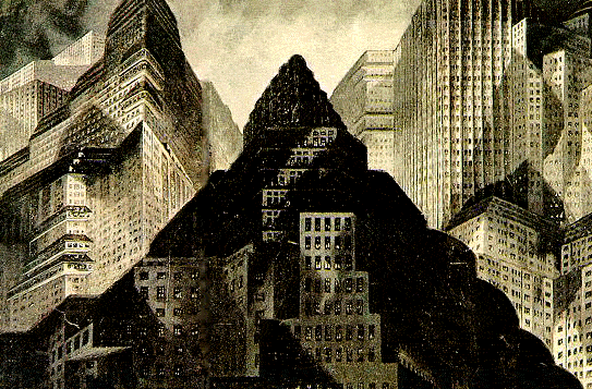
German Expressionism
By far the biggest influence on the look of noir was German Expressionism. Mostly because of the emigrating directors from Germany who came to find a base in the Holywood studio system and would go on to become some of the most successful directors in Holywood's golden era.
Few pics then a nice fun gateway to the world of German Expressionism, with loads of films.


http://www.mookychick.co.uk/reviews/events-arts-reviews/german-expressionism.php
Few pics then a nice fun gateway to the world of German Expressionism, with loads of films.


http://www.mookychick.co.uk/reviews/events-arts-reviews/german-expressionism.php
Lighting and Style influences: Poetic Realism
Emerging in France around the same time as Black Mask was getting its act together, Poetic Realism was both a stylistic and political movement. It was concerned with the everyday stories of the poor and working class and used light and dark, here, its put much better at this link:
http://www.criterion.com/explore/15-poetic-realism
Main point was, it wasn't realism, it was realism with a large dose of style. In fact noir was anti-realism in many regards, and this should be the beating conceptual heart of our design.
http://www.criterion.com/explore/15-poetic-realism
Main point was, it wasn't realism, it was realism with a large dose of style. In fact noir was anti-realism in many regards, and this should be the beating conceptual heart of our design.
Femme Fatal
One of the most distinguishing conceptual underpinnings of noir is the role of a transgressive or 'spider' woman who leads the hero/anti-hero to his doom, through a series of doors, all of which she controls by her alluring sexuality.
Her sexuality is linked with death and ultimately with the male character's own internal, deep rooted self-destructiveness which rises to the surface, much as his cock does, by the beauty, mystery and must-have-ness of this almost mythical godness figure.
Her placing, in the early golden period of noir, reflects many things about the society of the day and could be seen as an excuse for woman bashing since during that period, post war, women where to be encouraged out of work and back into the home: to know their place as such.
Plus, with the growing position of women, noir could be percieved at a loss to what the future held and this codifiying of them as fatalles was a last gasp attempt to put the cat back in the box.
I'm not satisfied with this role of fatalle, and its the cornerstone of the whole enterprise to have understood what role women are to play in Dangerous Days. Such categorisation could also disenfrancise a whole slew of potential audiences. It's a bit dated.
My own feeling is somewhere closer to Blade Runner where both the man and woman can 'kill' each other or kill themselves by their own actions and conversely, both can rescue one another as well. In fact, one of the most interesting films of the early cycle, Secret Beyond the Door positions the man as the fatalle drive (the Thantos) and the woman (Eros) whose love gives her the grace to see beyond the boundaries of her somewhat sadistic and tortured partner and ultimately save him.
Although he too, of course, gets to save her. This osscilation of deceit and redemption going backwards and forewards between the genders is interesting.
All characters dealing honestly with their grit and being understood because of this be still being prone to their own deadly drives is very interesting.
That said. The women have to be interesting looking. Here's some thoughts on what might turn out to be our two female leads. Carla Bruni's face is in there somewhere. Those thin lips. But I'm interested in real women, not stick waifs, or fantasy perfect projections.


Subscribe to:
Posts (Atom)